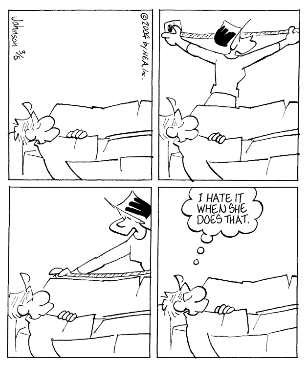
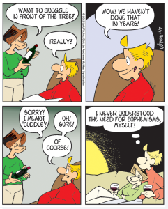
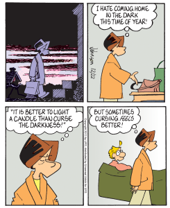
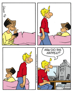
Why is the cartoon square? Actually, it is rectangular, slightly taller than it is wide, but it’s close enough we can call it square. I put a lot of thought into this seemingly drastic change. It isn’t called a comic strip for nothing, and it complicates the process of preparing a new post. So why did I do it?
It will not surprise you to learn the answer is our old friend, technology. What was wrong with seeing the comic as it was drawn? For many of us, nothing at all. However, the square comics look gorgeous on tablets and phones. The horizontal strips do not. Similarly, the new format is much more conducive to sharing on the all-important social media. I have tried to make this change easier for the majority of readers by designing the post page in a way that will enable desktop and laptop users to view them with little if any vertical scrolling, and the artwork in its new configuration is almost twice as big as in the old days. I have every confidence you’ll absorb this latest of life’s blows.
When I sold Arlo & Janis to United Media back in another millennium, I was already drawing in the familiar four-panel layout that we know today. Sarah Gillespie, my new editor, approved of this and suggested I make it policy. The syndicate liked to do this where feasible, because it was considered a selling point. Layout versatility supposedly gave desperate salesmen one final stab at a closing. “Look, it’s stackable,” they could tell wavering newspaper editors. This meant that, while the writing might suck and the art might stink, the new feature could be cut in two, stacked and made square, just as I am doing now. I doubt if many editors really got excited about a new comic feature because it was “stackable,” but in the burgeoning digital environment it actually makes sense. That’s why I say, What’s old is new.





2 responses to “What’s Old Is New”
That particular style works really well on phones – but the two column text format on the blog, sadly, does not.
Great change!