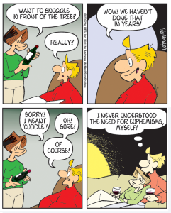
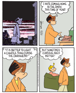
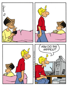
And a giant pat on the back if you can name all of James Dean’s movies.
A reader from Knoxville sent me a very nice email message, but he did have a problem. He enjoys Arlo and Janis in the newspaper, bless him, but he finds it particularly difficult to read. He questioned the “font” I use. Technically, I suppose “font” would be a correct term, but I tend to think of my comic-strip lettering as “printing,” which is what we called it in the second grade. I do it by hand, and I have had this complaint before, although the Knoxville letter was much too polite to be thought of as a “complaint.”
First, let me say I strive to keep the verbage in A&J to an absolute minimum without sacrificing the essence of what is being said. Brevity is the soul of wit, and all that. However, this simply is a good writing habit and has little to do with the issue. The real problem, of course, is the tiny space available to all cartoonists in today’s newspapers.
To get as many words in as possible without crowding out the drawings does require me to use a finer pen nib than I would like; in other words, the letters aren’t very bold. Several years back, I went to a drawing nib to accomplish this better, but I began to receive a lot of complaints about legibility, so I went back to a Speedball B-6 lettering point, which is a little bolder but not much. I might try a B-5, which is a tad bolder yet, but I feel as if I’ve already arrived at the optimum balance of lettering and writing. And I guess that’s the problem.


63 responses to “Beast of Eden”