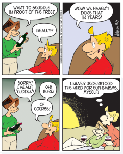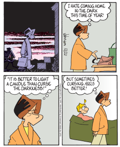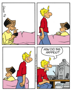


OK, so this comic strip from December of last year isn’t exactly “rare.” It’s Arlo and Janis sitting on the sofa, for cryin’ out loud. However, there is something out of the ordinary going on here. Can you tell what it is? That’s right! In the third panel, Arlo’s dialog runs to four lines. It is an unwritten rule here (where all rules are unwritten!) that dialog in a comic strip not run for more than three lines. You’d be surprised how easy this really is. Dialog tends to be terse and to the point, and much of what I write is dialog. I believe punchy dialog actually lends authenticity; remember that, would-be comic strip artists, and writers of all stripes.
I bring up dialog, because I periodically get emails from readers who complain (always nicely!) that they have a particularly difficult time reading the text in Arlo & Janis. I don’t doubt they have problems. Newspapers so reduce all comic strips these days that they’ve become almost impossible to read, particularly for the demographic that is keeping newspapers afloat. I do wonder, though, if A&J is particularly unintelligible. I look at other strips in the newspapers, and I don’t see many of them being any easier to read. I like to think it’s because Arlo & Janis is the one they want to read. Anyway, I have two points about this subject. 1) I am aware of the problem. I have gone to a thicker lettering pen, but I think this sometimes makes me squeeze the lettering, which probably is the worst thing I could do. I have experimented with computer fonts made from my own lettering. This is promising, but I haven’t been able to develop one yet that really pleases me. Perhaps I need to expand the three-line rule to four lines. In short, I am working on it. 2) I would like your observations and suggestions on this matter. It might help.


316 responses to “A Rare Arlo & Janis”
Ah, Laura Petrie, whata babe. Or should I say, “what an attractive woman?”
I WISH I could comment but back when a local paper (Sanford Herald) carried A&J none of the cartoons were reduced. Now the paper itself has been reduced to twice a week and carries only a couple of political cartoons.
JJ: In our paper (the Logansport, Indiana Pharos-Tribune) I do not find A & J any more difficult to read than any other strip. Perhaps that is because it is the comic I least want to miss each day! In fact, today’s comic is easier to read than Garfield or Hi & Lois or a few others. -Steve Moore
Houston Chronicle doesn’t carry A&J, thus forcing us into online readership. Nice feature about online is zoom.
Rufus, in the current vernacular Laura Petrie would be a MILF.
Further to previous reply: our paper does not “colorize” weekday comics. Do most papers do so? I think I actually prefer black & white! -Steve
Alas, the L.A. Times does not carry A & J. I discovered your little gem at comicsidontunderstand.com. I had to know what the “Arlo Award” connoted.
“Get Fuzzy” is by far the most difficult strip to read. Darby Conley text is extremely dense, although he very often comes up with some wonderful verbal tidbits. But for us seniors, it still needs to be read up very close – I hate bifocals – or with a magnifying glass.
“Dilbert” is the very model of a modern major comic strip writer. I marvel at how he is able to set up a situation and a punchline in three panels and still keep his exposition so concise.
Don’t worry, JJ. You are doing fine!
I meant to give Scott Adams credit for “Dilbert”. D’oh!
What’s a “paper”?
Strangely, the Get Fuzzy strips that are repeats from 2007 weren’t as difficult to read then as they are now (and the size hasn’t changed.) Hmm. could it be me that has changed?
Here in the Tampa Bay area there are competing papers, The Tampa Tribune and the Tampa Bay Times (formerly The Saint Petersburg Times.) The Times colorizes one of the two daily comic pages. I’m not sure about the daily edition but Tampa Tribune prints half their Sunday comics in black and white. Sacrilege!
Also strange is that the Tribune carries A & J seven days a week, the Times only on Sunday.
(Too much time on my hands.) Google research has shown that the Tribune has one color and one black and white comic page in the daily addition. I knew you were dying to know.
Edition* (dang auto-correct.)
I get the daily in The Fort Bend Herald (right southwest of Houston) in black and white but read all my gocomics.com in color. I have never noticed anything weird or unreadable about A&J in any form. I’d be afraid if you changed anything it be worse; isn’t that the way those things go? About dialog in general – I think I dropped Sally Forth years ago because it was just too wordy
I still subscribe to the local newspaper, but they no longer deliver, choosing rather to avail themselves of the services of the USPS. It doesn’t arrive courtesy of a buckskin-clad rider on horseback, but by the time I do see the paper, I’ve long ago read A&J online.
.
Way back in the aughts, when I read the dead tree version, I don’t remember that I had any problem seeing or reading the dialogue. But I’ll check the next paper I get; I do know the strips are printed smaller now. Without looking, I can recall that Doonesbury has been enshrunkened to the point the dialogue in the old strips that are being rerun is next to impossible to read. But of course I consider that a public service on the part of the newspaper. 🙂
Some strips are too wordy. Often Sally Forth, a comic strip that I like, will have way too much dialog. Sometimes you need a lot of words to make the gag, often fewer words are better.
John, if you want wordy, see 9CL. Better yet, don’t.
I have actually stopped reading comics that I used to read all the time because they’ve gotten far too wordy.
I originally noticed this with Cathy and stopped reading it years ago because it was so annoying.
I’ve recently stopped reading Sally Forth because it’s becoming very similar to Cathy with far more wording than can fit in the window comfortably.
For me it’s NOT an issue of the font is too small. It’s lengthy and unnecessary verbiage.
Arlo and Janis doesn’t have this problem, and for me the 4 lines presented in panel 3 of this example is NOT an issue.
Dear JJ, I have no problem reading the lettering in A&J. Only very occasionally does a curve on one letter next to another letter make it maybe look like something else for a moment, but your lettering is quite good, if not some of the best. For truly bad word-ballooning, there’s Zenas Winsor McCay: no planning atall atall, I even repeat. Of course, that didn’t matter one whit, for no one ever read McCay for the lettering or story. Planning and a disciplined pen line: Those are two things it seems many syndicate editors don’t worry about much now. They’ve been convinced, along with many artists (and readers) that bad drawing and lettering are funny, and they’ve let a lot of inferior features in the door. Not much funny, I say.
Rick Marshall once pointed out that in “Happy Hooligan” all the characters were drawn funny but with absolutely correct proportions. They are funny because the proportions are still good. Bad drawing—and bad lettering—are just that. But good drawing and good writing make even talking heads once in a while a really good thing, and Percy Crosby’s “Skippy” was full of that. What else is nice about your third panel is that there is one basic thought, but it is supported by a list of three examples. (I am sorry to confess I cannot place the Andersons.)
The Boston Sunday Globe definitely has shrunk A&J down to a size that is very hard to read! More than other comics (although they too are a lot smaller than they used to be.)
Jackie, we got them at a tourist-y gift shop at the Lower Tahquamenon Falls. We were using Deet, but its been a really wet spring and there are more skeeters than usual this year—and they are DESPERATE for food! I think your best bet would be a sporting goods store, someplace like Cabela’s, Dunham’s, or Dick’s.
The jackets are a finely woven material, Ghost…think of a silky camo negligee. They do let the breeze through…kind of.
It might be time, sand, to start gathering up the electronics two by two.
I saw a young eagle this morning and thought of you, c ex-p. He was on the ground, but took off when he spotted us.
JImmy, with the size reductions newspapers have put in place, many strips are more difficult to read than they used to be, but A&J is not one of them for me.
Denise, so far today TS Bill has not done us much harm. Latest forecast indicates we could get side swiped over the next few hours. Victoria, Texas is setting front and center of the land fall; they’re 120 SW of us.
DJJG, the Andersons: Father Knows Best. Thought I knew it, but had to look in Wikipedia to be sure.
DJJG, the Andersons were from “Father knows best”
Jackie: http://www.bugshirt.com/
Mark in TT I was the same. I knew it was familiar but had to use the google.
The Tennessean prints the dailies fine, but the Sunday comic is very small.