


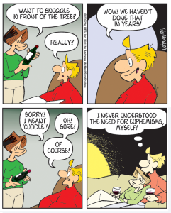
OK, so this comic strip from December of last year isn’t exactly “rare.” It’s Arlo and Janis sitting on the sofa, for cryin’ out loud. However, there is something out of the ordinary going on here. Can you tell what it is? That’s right! In the third panel, Arlo’s dialog runs to four lines. It is an unwritten rule here (where all rules are unwritten!) that dialog in a comic strip not run for more than three lines. You’d be surprised how easy this really is. Dialog tends to be terse and to the point, and much of what I write is dialog. I believe punchy dialog actually lends authenticity; remember that, would-be comic strip artists, and writers of all stripes.
I bring up dialog, because I periodically get emails from readers who complain (always nicely!) that they have a particularly difficult time reading the text in Arlo & Janis. I don’t doubt they have problems. Newspapers so reduce all comic strips these days that they’ve become almost impossible to read, particularly for the demographic that is keeping newspapers afloat. I do wonder, though, if A&J is particularly unintelligible. I look at other strips in the newspapers, and I don’t see many of them being any easier to read. I like to think it’s because Arlo & Janis is the one they want to read. Anyway, I have two points about this subject. 1) I am aware of the problem. I have gone to a thicker lettering pen, but I think this sometimes makes me squeeze the lettering, which probably is the worst thing I could do. I have experimented with computer fonts made from my own lettering. This is promising, but I haven’t been able to develop one yet that really pleases me. Perhaps I need to expand the three-line rule to four lines. In short, I am working on it. 2) I would like your observations and suggestions on this matter. It might help.



316 responses to “A Rare Arlo & Janis”
“… a silky camo negligee.” As always, Denise, you certainly know how to turn a phrase. If you should ever decide to take up writing professionally, might I suggest the seldom-encountered-but-always-titillating (for some of us) genre of “military porn”?
Unfortunately, many of the hottest days in our neck of the woods are also what my grandmothers would call “still days”…not a breath of air moving.
In some wooded necks, “still days” are those where the “gentlemen” folk are off tending to men things.
As in doing QC on the latest run from the “still”?
sand, live TWC video from your neck of the woods currently shows…rain. If you look very, very closely. And the wind not moving a hair on the head of the male reporter. Of course, he probably used a full can of hairspray on it this morning.
Ah, for the good ol’ days when TWC sent their female reports out into the wind and rain wearing just their official TWC t-shirts.
Mark, thank you as always. I wish I could remember the joke about Upper P people marrying mosquitoes but I do remember where, an ice cream stand with Moo in name which had just won the Morning Shows best ice cream in America award. Do not remember what flavor I had but probably sugar free pecan which was previlent up there, as were moose tracks
I do remember lines and mosquitoes
Mark, by the time I get to towns selling shirts I will be needing one. But refresingly, I have already been in every town on list in America
Which says a lot about our travel habits.
Jimmy, Tulsa doesn’t carry you, so I read you here. Occasionally I find you in towns I travel to and never have trouble reading. Unfortunately I have ceased to care about anyone but Arlo and Janis fate.
And that is sad remark. Love, Jackie
OF scheduled to go off now, but the site shows only a black screen – at least, for me.
To me, “Bloom County” takes the prize for verbosity. I’ll probably quit looking at it totally one of these days. Already, if I see too much wordiness, I skip it for that day.
I find the lettering very easy to read in A & J, and the amount of wording to usually exactly fit the need of the particular strip. If I want to exercise my ability to withstand wordy I go to Pibgorn, or 9 Chickweed Lane. They are usually fairly funny, but take a huge amount of dialog to get there. Even there, there are exceptions to that rule. It should be noted I read most of my comics on line. It never ceases to amaze me the perfect set up in so few words the is the hallmark of A & J.
Jackie I lived in Da U.P. a number of years and met more than a few “chiquitos”. A crossbreed of a chicken and mosquito with a 5 foot wingspan, and a six foot beak. Two of them caught the neighbors beagle and drained it dry in less than 10 minutes.
Just saw the radar for the Texas gulf coast, Houston…..be safe, be alert, and most of all….prayers on the way…………………………………………………Amen.
It will not let me type your nane ursen, I managed to do it finally embedded. That one is funny, anyone else know some funny UP jokes? I cannot remember a one but laughed a lot with locals while fighting swarms. And I am going back to donate more, didn’t meet quota.
Ghost I am worried about you. You do not seem happy for months now. I miss your wicked and wanton humor. The fact I am happy makes me feel guilty. You know how Southern women are, we want everyone to be good and if they can’t well, then wickedly funny and politely sinful.
Love, Jackie
https://www.youtube.com/watch?v=Ki-jgj7zbVs
Just for you Jackie
https://youtu.be/M-O5QTpBvHw
Jackie, this might perk up our Ghost.
ursen, I thought a Chiquito was that yellow fruit that comes in bunches that you should never store in the refrigerator?
Jimmy, I don’t have trouble reading your lettering online, even if I don’t zoom.
And to the folks that are dropping strips because they are hard to read, that’s a shame. Many of the classics couldn’t survive today’s shrinking because either the art or readability or both would suffer. Can you imagine Prince Valiant without those huge, detailed panels? Or the various strips that depended on language to move the plot along, like The Phantom? I think the current rash of bad art/lettering/writing is due to the fact that the small size of the daily panels enables them to get away with it. If they were printed in the size of 50 years ago, their shortcomings would be all too obvious and readers would demand a change.
Keep up the good work, Jimmy. We need you for your originality and as a good example to the new generation of cartoonists.
And now for the weather: 97.8 with a heat index of 103. And no rain coming.
Thanks Mark! 77°, overcast, with intermittent rain.
Nodak Wayne and Mark in TTown (which I always figured means Tinsel Town): Thank you! I would not have remembered that, though I did watch Father Knows Best.
And agreed about Prince Valiant and those big cartoon sizes. But I suspect a large number would not now complain, being so used to mediocrity or worse. Andy Gump and Pogo Possum ran for President (not at the same time), but I can’t see any cartoon character doing that and gaining the following those two characters did.
Speaking of Pogo Possum and wordiness! But we could read every word.
Yet such wordiness or (I am groping for a word here) “line-iness” like Walt Kelly’s is not the style of Skippy, A&J, or Peanuts. You’d never have seen one of Walt Kelly’s elaborate swamps or glorious trees in Peanuts! And wouldn’t one of those trees look so funny in A&J—
Actually, the toughest strip for me to read is “Get Fuzzy”. Really scrunched lettering. I’ve read a number of the old comic strips–Katzenjammer Kids, Gasoline Alley and so on–and some of them were tough to read because of the printing. I don’t have a problem reading it A&J. To me, it’s really about clarity of lettering. As someone with the penmanship of a toad studying to be a doctor, I appreciate clear lettering, and A&J has it. So don’t fret it!
OF due 6:00pm mountain time, give or take :10.
Yep, Pibgorn can be extremely wordy, but it’s sometimes fun to decipher what is meant.
Thanks for caring, Jackie. Life and all. But it’s getting better. And I am truly happy that you are happy now. You’ve been through more than I have, but I’ve been through enough to know that you deserve it.
I’ll work on “wickedly funny and politely sinful”, I promise. Come to think of it, there’s some pretty good fodder there in your reports of your northern trip. 😉
Love, Ghost
DJJG, actually it stands for Tuscaloosa, TTown is a nickname for it. And Walt Kelly’s lettering. How could you fit PT Bridgeport’s flashy version into today’s panels and have room left for the art?
http://media.fontbureau.com/images/posts/2009/pt_excited.jpg
Or these characters: http://www.fontbureau.com/blog/for-spring-hath-sprung-the-cyclotron/
Debbe 😉 As a solution to your lack of a weapon, try the following:
1. Find rocks the approximate size and shape of eggs
2. Imagine the target looks like “Skittles”
3. Vigorously throw “eggs” at center-mass of “Skittles”
Although it is true that orange is my favorite color for a string bikini, in the interests of full disclosure I must add that, in my opinion, there is no poor color choice for a string bikini. 😉
For Debbe https://www.facebook.com/AadhiOfficial/videos/280263382182987/
Ghost, my favorite color for a bikini is yellow, with polka-dots.
Somehow I don’t think that rooster is going to get many dates.
Sideburns, my idea of a proper string bikini is one that wouldn’t have space on it for polka-dots. 🙂